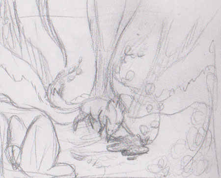
So a few months ago in a sleepy stupor I stumbled into the Amherst Family Center and drew this thumbnail while someone watched my kid for a few. At the time I thought it was genius, and put it away thinking how I couldn’t wait to get started on the painting. It was maybe 1.5 inches long, and in the corner of the sketchbook tucked amid terrible stick figures and some experimental drawings of a newborn’s head.
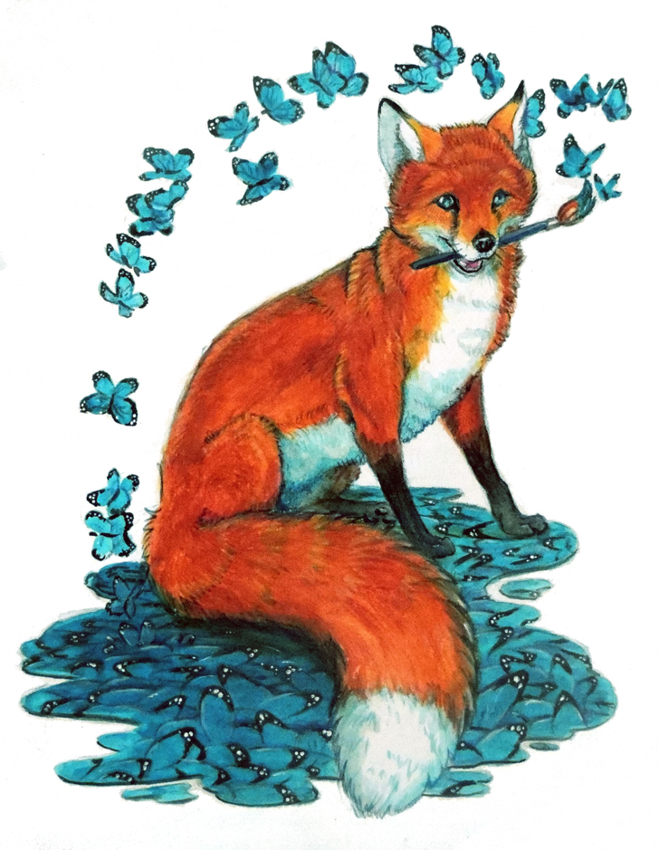
I was so sure it was a winner at the time. It’s too bad I didn’t take very good notes (er…any in this case) so I have no idea what colors go where or what I was thinking when I doodled it. Alas while I can get about half-way I’m just not sure what all those lines represent. Worse, this is supposed to be a surrealist piece, so I *really* don’t know what the background is aside from it’s inspired by this piece with similar colors.
This brings me to the importance of notes. In this case, there was months between the thumbnail and me finally getting to it. In rare cases, it can take years. A picture so vivid at the time can fade, even though it doesn’t seem it! Notes can help refresh the memory and make a seemingly confusing thumbnail into a descriptive thing.
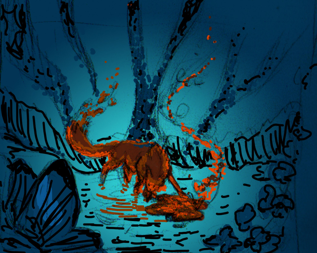
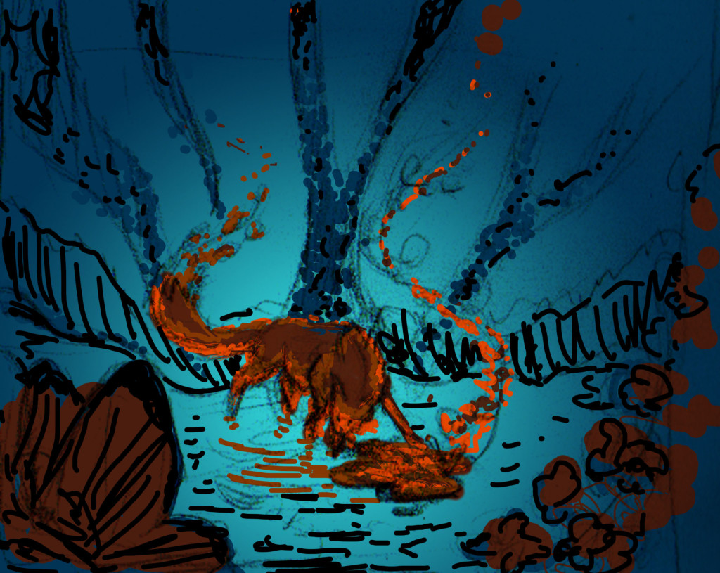
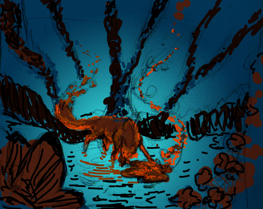
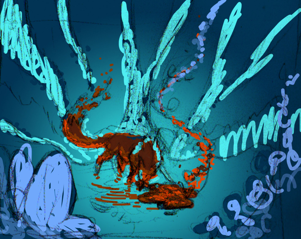
The only other method that I have of working it out is to experiment. Thank god for Photoshop. I’ve been gone and played with different color/value schemes for the initial layout:
I might do many of these, I might only do a few. It’s hard sometimes to get back the vision. So far I’m really liking 2 but 3 comes pretty close too.
I might need to just scrap it and do another thumbnail. I haven’t decided yet. Only after I decide to proceed do I refine the pose and anatomy. This is a step I used to get backwards, now I realize that visualizing the composition will do far more than just the fox. The details can be tweaked later, *if* I decide to go forward.
Granted…it’s not like the Fox needs yet another painting…

The Fox always needs more paintings- it is, after all, a vain creature!
I like 2 because I think the orange balances out the foreground, but I’m intrigued by that peek of bright blue in the foreground of 1. Not a fan of all the bright blue in 4, but the touch in 1 has caught my interest, and I’d like to see what you develop out of that.